Principles of ArtUNITY:
This picture shows the comparison between light and dark and that even the most opposite people can be the best of friends. I blurred the outer rim of my picture to give it focus on whats going on rather than on the photographs surroundings. This picture can also include the difference in how people look or act but in the end were all people and thats what matters. RHYTHM: The movement of the people give the picture motion and a realistic feel which makes the picture more interesting. However this picture was a little blurry but the formation gives the picture a little more clear. This picture was done on the football field while kids were working out during phisical education. VARIETY: I chose this picture for variety because not only does it have so many different interests of kids on campus but also the paint splatter gives a unique and colorful feel. I included the sun in the corner because it gives the picture a foggy look and makes the picture look more memorable. Also I thought that in this picture that all the different things you can be interested in but also be united with people who are completely different from you. HARMONY: I chose the picture of a tree for harmony because of the contrasting colors and the comparison between the different colored leaves. I also notice how the tree changes colors the higher you go up the tree because of the shadows from the leaves above. In this picture i made the tree darker which brought out its color and made the sky a little more faded which makes the main point of the picture pop. EMPHASIS: The picture of this spikey prickaley plant gives emphasis because the plant is surrounded by dirt which makes the plant pop and seem bold. The plant has a yellow on the tips which makes the green took bright and more defined when comparing it to the dirt. When I edited this picture I made it brighter and and used contrast so that the pictures color could be evened out which gave it a bold touch. PROPORTION: I use this picture for proportion because when taylor crawled up in to the tree I noticed that although Taylor is much taller than me he still wasn't taller than this tree so in the process of Taylor getting scratched up we took a picture of Taylor jumping off the side of a tree. The shadows also give emphasis on the proportion to the tree and how long its branches stretch out to the sides of the picture. This picture was darkened because rather than focusing on Taylor as a person I wanted to focus on how tall he was. BALANCE: I chose this picture as balance because I wanted to include some school pride as well as when I first saw it i looked at the horns of the longhorn and its symmetry on each site. The circle around the longhorn also helped give the longhorn a sense of equil measurement. I darkened the picture to help withe the sun flashing off the longhorn and the darkness gave the wood a more deep definition.
0 Comments
ELEMENTS OF ARTSPACE:
This picture shows SPACE and GIVES the hallway DIMENTION and makes the RED DOOR at the end of the hallway POP. This picture can mean so many things such at the path to education or what can people expect when they walk on to RBV campus. The element is the hallway and the deep red at the end of it. This shows opertunity and a new start for freshman on campus. We don't judge and those who do are too insecure about themselves so listen to your heart and it will show you the way. LINE: This picture shows topics and detail in each book and each line gives a different story, a different adventure, and a different experience trapped inside something wanted to be known. The representation of a line can change the most significant dimention and tells its own story with in. The fade of each book gives the look numerous loads of information that each day sits on a shelf. SHAPE: The shape and detail of the light gives off a bright but multi dimentional look that shows the observer the pop of color from the rusted metal and the texture give the picture volume. The shape of the light gives a familiar look so it can be related to but is still different because of the brightness of the picture. I chose this picture because I thought no one else would notice the exact things that light out way. COLOR: This picture shows vibrant details and the bench that I found makes the jacket stand out which gives it dimention. The bench also gives a childish fun kind of look to brighten up the emotion in the picture. However I noticed that the floor is a gray color and the contrast between the bright colors and the gray gives a place of sanctuary. TEXTURE: This picture of the track gives volume and a pathway to the photographer. Especially those who have experience that rush of a sport and the emotion that can take over and this need to win and be faster than any one else. The perserverence of how far and how fast you can go to succeed not only for yoourself but also for your teem who has now become your new family. FORM: When i first noticed the bench while we were looking for pictures to take i noticed how the shadows under the bench and the way the sun flared onto it. The bench showed dimension and meaning which seemed like it had so many stories to tell. The look of the wood gave it tester and a sense of reality. I also added warmth to the picture so it gave the picture a happier more vibrant appeal to the photo graph Value: This picture shows the light and dark of the picture as well as the detail that is shown in the darkness. The shadows shows emphasis and detail and makes the brighter parts of the steps look even more bright. I gave the picture a little bit of a tint so that the picture looks a little more realistic. 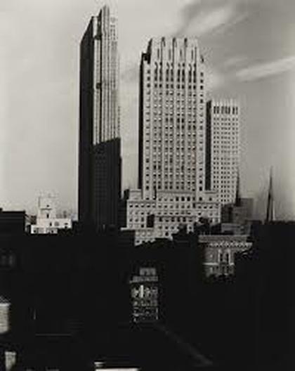 Alfred Stieglitz American, 1864–1946 New York, From The Shelton, 1935 Gelatin silver contact print on warm-toned paper Alfred Stieglitz American, 1864–1946 New York, From The Shelton, 1935 Gelatin silver contact print on warm-toned paper This picture shows the line and structure of the buildings in the city and gives the picture a line effect to make the shape of the picture to pop and easier to notice. This picture also shows how big the city is and the divide between the rich and the poor because the rich usual has the better views and places to live. 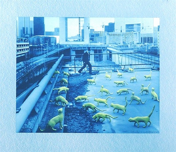 Artist: Sandy Skoglund (American, born 1946) Title: Cats in Paris, 1993 Medium: Prints and multiples, Lithograph Size: 24.5 x 28.5 in. (62.2 x 72.4 cm.) Movement: Contemporary Art Catalogue: Derriere L'Etoile Studios Inventory Catalogue Price: 4,500 USD Artist: Sandy Skoglund (American, born 1946) Title: Cats in Paris, 1993 Medium: Prints and multiples, Lithograph Size: 24.5 x 28.5 in. (62.2 x 72.4 cm.) Movement: Contemporary Art Catalogue: Derriere L'Etoile Studios Inventory Catalogue Price: 4,500 USD http://www.artnet.com/artists/sandy-skoglund/cats-in-paris-a-AKqW-BZJBl_2qCHJR177Wg2 In this picture it seems that the man doesn't notice the many cats on the roof and also it seems that he is in his own world because him and everything around him is blue except for the cats. This shows a good example of color because of how bright green the cats are and how everything else is blue. 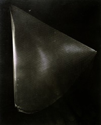 László Moholy-Nagy (Hungarian, 1895–1946) Title: Untitled, Chicago, ca. 1937 Medium: Photographs, Gelatin silver print, ferrotyped; printed c.1937 Size: 10 x 8.12 in. (25.4 x 20.6 cm.) Movement: Modern Art Catalogue: Art Basel, Wednesday, June 15, 2016–Sunday, June 19, 2016 László Moholy-Nagy (Hungarian, 1895–1946) Title: Untitled, Chicago, ca. 1937 Medium: Photographs, Gelatin silver print, ferrotyped; printed c.1937 Size: 10 x 8.12 in. (25.4 x 20.6 cm.) Movement: Modern Art Catalogue: Art Basel, Wednesday, June 15, 2016–Sunday, June 19, 2016 http://www.artnet.com/artists/l%C3%A1szl%C3%B3-moholy-nagy/untitled-chicago-a-vWM-uWVa7Lchg7MtGclKIw2 Although this picture is dark is shows the specific shape and depth of the object. The lighting in this picture also helps show the definition of the shape and its condition. This is an exceptional example of shape because it shows the observer how its three diminutional with out giving the person the actual object. 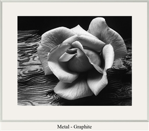 ROSE AND DRIFTWOOD By: Ansel Adams Made in 1932 ROSE AND DRIFTWOOD By: Ansel Adams Made in 1932 The detail and background of the flower is magnificent and the detail of the pedals gives volume to the picture. The form of the flower gives the mood of beautiful but also old school because of the black and white. This is a beautiful example of form because because the flower must have just been picked because its stiff but not too stiff and still looks natural.  Honu Kiss By: Clark Little Made in 2014 Honu Kiss By: Clark Little Made in 2014 The color in this picture was shocking and shows the observer the intimacy between two beautiful creatures that we don't see very often. The detail also gives you that feeling that you could just go reach out and touch the two turtles. Finding an example for texture was difficult but after having the experience to travel to the Hawaiian Islands it give a sense of living my trip over again and being able to touch the shell of the turtles. 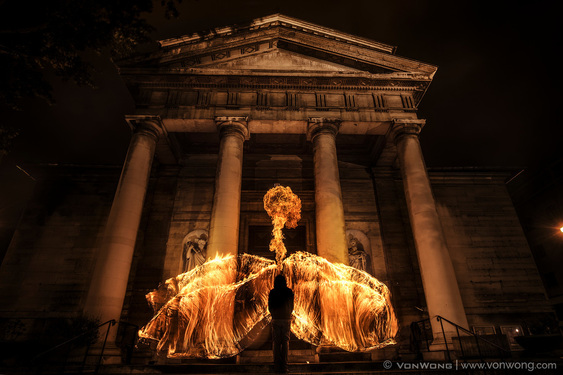 Das Angel/ Ben Vong Wong Das Angel/ Ben Vong Wong This picture caught my eye because how the fire almost looks shredded as if its spreading to other parts of the detailed building. I also liked the drama that came with the picture and it reminds me of what rage would look like. This picture shows value because of the detailed building and the multi direction of fire which conflicts with the dark shadows of the person. 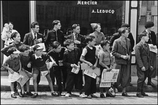 FRANCE/1935/Tour de France/ Robert Capa FRANCE/1935/Tour de France/ Robert Capa when I first observed this picture i wondered what they were looking at and how the repetition of kids and teens possibly to look both ways before crossing the street. Also the children's attire were different than what they are today which showed the age of the photo. This picture shows rhythm because there all looking the same way in the same formation at the mysterious object down the street. 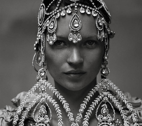 House of Lavande/ANNIE LEIBOVITZ 03/28/2013 House of Lavande/ANNIE LEIBOVITZ 03/28/2013 This picture was extremely elegant and detailed which made me think that she may be a queen or royalty of some sort. The look in her eyes show something different though, they have a prideful desperation to them as if she were read for war. This picture shows symmetry because the detail is exactly the same on both sides. 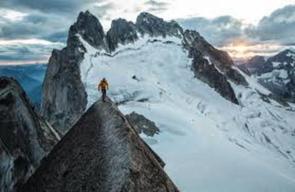 Jimmy Chin/Stockland Martel/ Jimmy Chin/Stockland Martel/ The mans surroundings are dangerous and one step in the wrong direction could be his end. The mountains behind him make it look like he's been through a long journey and is almost to the end. This picture show proportion because it show how large the mountains are and how small the man is. 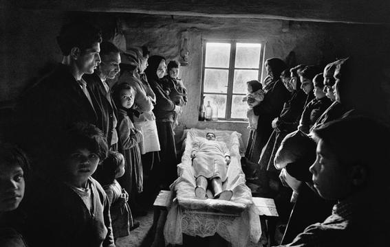 Josef KoudelkaCzech/French, b. Czechoslovakia 1938 Josef KoudelkaCzech/French, b. Czechoslovakia 1938 This picture is sad but true and the only thing that is truly set in sone is death but the faces on these children show fear and sadness. The shadows across there face gives the picture dimension and repetition. Although small the filled room of people gives a good show of space and focus. 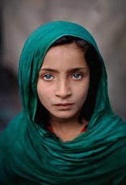 pashawar pakistan Steve Curry pashawar pakistan Steve Curry The intensity of color in this picture is astounding and extremely vibrant which makes the store of this young girl and her believes even more questionable. The girls eyes also pop which gives the observer to focus on something other than her cover up which she is required to wear. The girls cover up also give emphasis to the photograph and how she lives amongst her people. 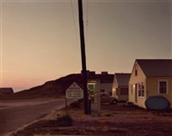 Joel Meyerowitz Roseville Cottages, Truro, 1976–printed:, 1977 Howard Greenberg Gallery Joel Meyerowitz Roseville Cottages, Truro, 1976–printed:, 1977 Howard Greenberg Gallery This picture show small detail however it also gives the observer that homey feel of small towns and the connection to people. She sunset is also gives the picture a smooth feel of looking over the cliffs watching the sunset. This picture shows harmoney because everything seems to fit together and flow. 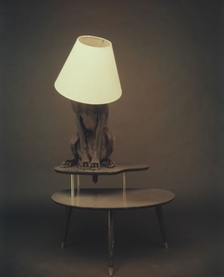 William Wegman, Lamp Stand, 1997 William Wegman, Lamp Stand, 1997 At first when I saw this picture I didn't know what to think or say but it was just so adorable. The lighting in this picture shows the main subject and proves that the photographer had some creative ideas. This picture gives variety because its a dog with a lampshade on its head and it it doesn't get any cuter than that. 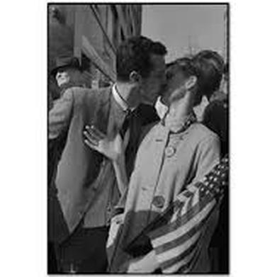 Vietnam Pro DemonstrationManhattan, New York, Marry Ellen Mark Vietnam Pro DemonstrationManhattan, New York, Marry Ellen Mark This picture is extremely typical and common for its time period and its extremely american and patriotic. This picture represents the 1960s and typical couples during that time period which makes the picture perfectly. This picture shows unity because the couple is bound by their nation and by each other. Elements And Principles Of Art
|
Hanna LykensHello citizens of the world... Archive
June 2017
Categories
|
 RSS Feed
